The year 2020 was a frenzy to turn the beige into something bright and interesting, as most of us had to stay at home.
Often I’m asked if choosing colour and pattern is wise or will it date? My motto is, if colour and pattern bring you joy, it doesn’t matter what the latest interior trend is; it’s your home and special space. How it makes you feel is what is important. How we decorate really should reflect you.
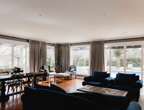
The Lounge
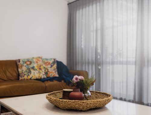
This room is used every day; it’s a room that is cozy during the winter and light and bright in summer.
A small intimate room that boasts wonderful daylight. It was however really very beige and safe. A gas log fire the centre piece to the room with an original Moran lounge suite, this room was in need of a lift.
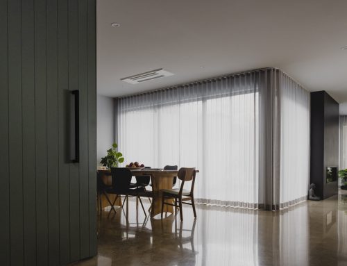
Exit the brown curtains and beige walls. Transforming flat, dull walls into something with depth and interest, with the creation of wall panelling, incorporating the fireplace, constructing a lintel and continuing with the panelling, the fireplace looks like it’s always been there.
Painting the lower third of the wall to match in with the architraves and skirting, broke the depth of the upper paint colour. Throughout the home, a touch of blue/green is featured, therefore this green provides the perfect welcome to the home.
The Moran lounge suite undertook a facelift together with the walls. One of my favourite cloths from Mokum Leila was the inspiration for colour and depth for this room. The lounge suite, petite but perfectly in proportion to the room, needed some care. With a refurbishment of springs, webbing and foam, together with a new cover, the suite design complements the complete room setting. Accent piping was incorporated to add a little bit of interest.
The drapes, deep pinch pleated onto a custom coloured timber decorator track with acorn finials, adds beautiful colour to the window. A soft 100% printed linen, Leila colour Rosewood, picks up the blue/green of the walls and lounge suite and adds a feminine touch with a rose pink scattered amongst the design. Taking the drapestwo-thirds above the architrave lengthens the window but doesn’t overtake the room.
- Paint: upper wall in Dulux Goyder Green
- Paint: lower wall in Dulux Natural White
- Lounge Suite fabric: Villa Nova
- Drapes are from the Mokum, Leila Collection in Rosewood


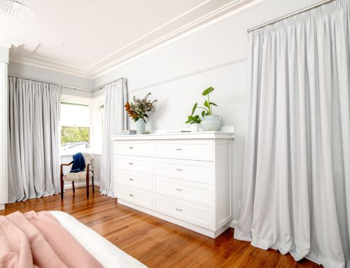
Master Bedroom
In particular light, the drapes sparkle, adding movement and elegance that the room demands.
Previously this room had pendant lighting and colour on the window, attempting a coastal feel; it didn’t seem to work. This room is large and has a great deal of light during the day; with the walls beige (Dulux Grand Piano) whilst it was neutral, it was a little dull.
Enter wallpaper, texture and more panelling with depth of colour to the walls…
Emma Shipley’s illustration design is intricate, quirky and colourful. With a love of cats too, the Sphinx wallpaper design was the obvious choice. The colour scheme of this design enabled the room to take on a few colour choices applied to different interior elements such as the bedhead, bedcover, cushions, wall and drapes.
As the bed is quite tall, the bedhead was also required to have height to give balance to this main piece of furniture. Working with the blush colouring of the wallpaper, the bedhead doesn’t interrupt the design; rather works with it.
Installing the drapes two-thirds above the architrave, again accentuated the height of the room. Keeping the drapes in from the corners of the wall stops the drapes from overtaking the wall. With such a large window, having the drapes clear the window, wasn’t a priority; rather it was the balance that was important. Keeping the colour neutral keeps the window fresh but also, should the room be redecorated in the future, the drapes shouldn’t need to be updated.
Dulux Coalition was chosen to offset the blush of the paper, however works in well with the wings of the Sphinx illustration.
This bedroom is a relaxing space to be, which is important at the end of the day. Again, it’s a design that brings joy and colour, however the mood of the day begins.
- Drapes are from the XX collection
- Wallpaper: Emma Shipley